
Why Crammed Two-Line Plaques Fail From the Curb
Adding a street name, estate title, or directional arrow beneath your house digits transforms an ordinary number plate into an architectural wayfinding landmark. Yet poorly proportioned two-line custom address plaques are the single most common source of buyer disappointment: designers shrink the primary digits to squeeze a 16-letter street name onto a 12-inch blank, set both lines at nearly equal height so they compete visually, or leave zero negative space inside the decorative border.
Highway sign engineers and environmental graphic designers solve multi-line legibility mathematically. By applying proven stroke ratios, inter-line channel spacing, and optical kerning before metal is poured or stone is carved, a custom plaque reads effortlessly at 30 mph while looking balanced up close at the front door.
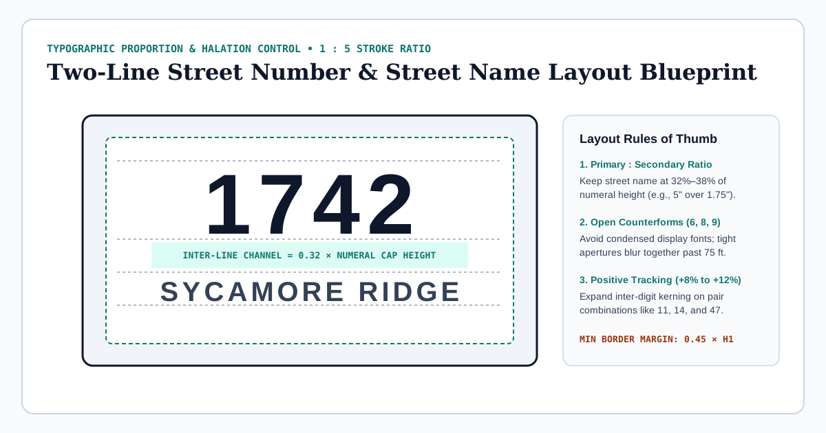
1. The Golden Hierarchy: Primary Digits vs. Secondary Street Name
Emergency responders, delivery drivers, and guests scan for your street number first from 60 to 150 feet away, then confirm the street or estate name as they slow down. When Line 2 exceeds 45% of Line 1's cap-height, the two rows merge into a cluttered block of text at distance.
- Ideal Secondary Ratio (32% to 38% of H1): Pair
4.5-inchprimary numerals with1.5-inchuppercase street-name letters, or pair6.0-inchestate numerals with2.0-inchsecondary capitals. - Inter-Line Breathing Channel (0.30× to 0.36× H1): Leave at least
1.5 inchesof clean background separation (or a thin 0.125-inch architectural divider rule with 0.65-inch clearance above and below) when primary digits are4.5 to 5.0 inchestall. - Border Margin Envelope (0.45× H1): Never allow the first or last digit—or the curve of an arch—to approach closer than 45% of the primary numeral height from the raised perimeter frame. Crowded borders trigger visual "crowding masking" in peripheral vision.
2. Open Counterforms & Stroke-to-Height Ratios (1:5 to 1:6)
Typefaces designed for print books or luxury wedding invitations collapse when viewed outdoors under angled sunlight or vehicle headlights. Three typographic metrics govern real-world legibility:
- Stroke-to-Height Ratio: Both the International Fire Code (IFC §505.1, minimum 0.5-inch stroke on 4-inch characters) and FHWA Clearview research converge on a stroke thickness between 1:5 (20%) and 1:6.5 (15.4%) of character cap-height. Hairline Bodoni serifs disappear at 45 feet; ultra-black novelty fonts turn internal loops into solid blobs.
- Open Counterforms on 3, 5, 6, 8, and 9: At twilight, closed-aperture typefaces (such as standard Helvetica or Impact) cause the terminals of
6,8, and9to bridge together via optical halation. Architectural humanist sans-serifs (Futura Medium, Frutiger/Clearview derivatives, Gotham Medium) and classic Trajan/Garamond monumental serifs keep wide open counterforms that remain unmistakable past 100 feet. - All-Caps vs. Small-Caps on Street Suffixes: Setting
SYCAMORE LNorOAKMONT DRin tracked uppercase eliminates descenders (g,j,p,y) that otherwise crash into the bottom border rail.
3. Optical Kerning & Positive Tracking on Raised Relief
Because raised bronze bevels, V-carved shadows, and standoff drop shadows add physical thickness around every glyph, standard desktop font kerning is always too tight for dimensional signage. Professional plaque layout applies +8% to +12% positive tracking on primary digits and +12% to +18% tracking on smaller uppercase street names, plus manual pair adjustments:
| Problematic Digit / Letter Pair | Optical Failure Without Manual Kerning | Studio CAD Correction |
|---|---|---|
11, 14, 17 |
Parallel vertical stems fuse into a single wide bar from oblique driveway angles | Add +15% to +20% extra inter-character space beyond tabular width |
47, 74, LA, WA |
Opposing diagonal strokes create an awkward white gap that splits the number in half | Tighten optical pair kerning by -6% while preserving minimum 0.35" tool path clearance |
68, 89, 00 |
Adjacent round bowls bloom together on bright brushed brass or white enamel | Expand bowl-to-bowl gutter to at least 1.25× stroke width |
1/2 or APT B Suffix |
Full-height suffix reads as an extra street digit (412B misread as 4128) |
Set unit letter at 65% cap-height aligned to top cap-line with a 0.6× gutter |
4. Sizing Plaque Width to Long Street Names Without Shrinking Digits
What if your house number is only two digits (28), yet your street name is 19 characters (WHISPERING PINES RD)? Never shrink the primary digits to match a narrow plaque! Instead, choose an elongated 20 × 10 inch horizontal rectangle or arch-top estate silhouette: center the bold 5.5-inch 28 generously in the upper crown flanked by subtle architectural florets or horizontal rules, and let the 1.5-inch street name span comfortably across the lower register using standard USPS suffix abbreviations (RD, LN, PL, BLVD).
5. Vertical Pilaster Layouts vs. Horizontal Arch Proportions
When a porch column or stone mullion is only 6 to 7 inches wide, forcing a two-line horizontal plaque creates awkward overhang lips vulnerable to snagging. In narrow pilaster scenarios, switch to a vertical stacked numerals plaque (typically 5.5 × 18 inches or 6 × 22 inches) for the street digits alone, omitting the street name unless the property sits at an ambiguous corner intersection. Stack vertical digits upright (never rotated 90 degrees sideways) with an inter-digit vertical cadence of 0.35× to 0.42× cap-height, and widen top and bottom end margins to at least 2.25 inches to clear concealed mounting bosses or decorative rosette caps.
Test both horizontal two-line layouts and vertical column proportions in real time using our Two-Line Plaque Dimension & Border Calculator, or compare silhouette geometries inside the Custom Plaque Studio.
Ready to Preview Your Custom Two-Line Plaque?
Test silhouettes, bronze vs. slate finishes, and kerning proportions in our Live Custom Plaque Composer or email your project specs to info@customaddresssigns.com.